Ombre
OVERVIEW
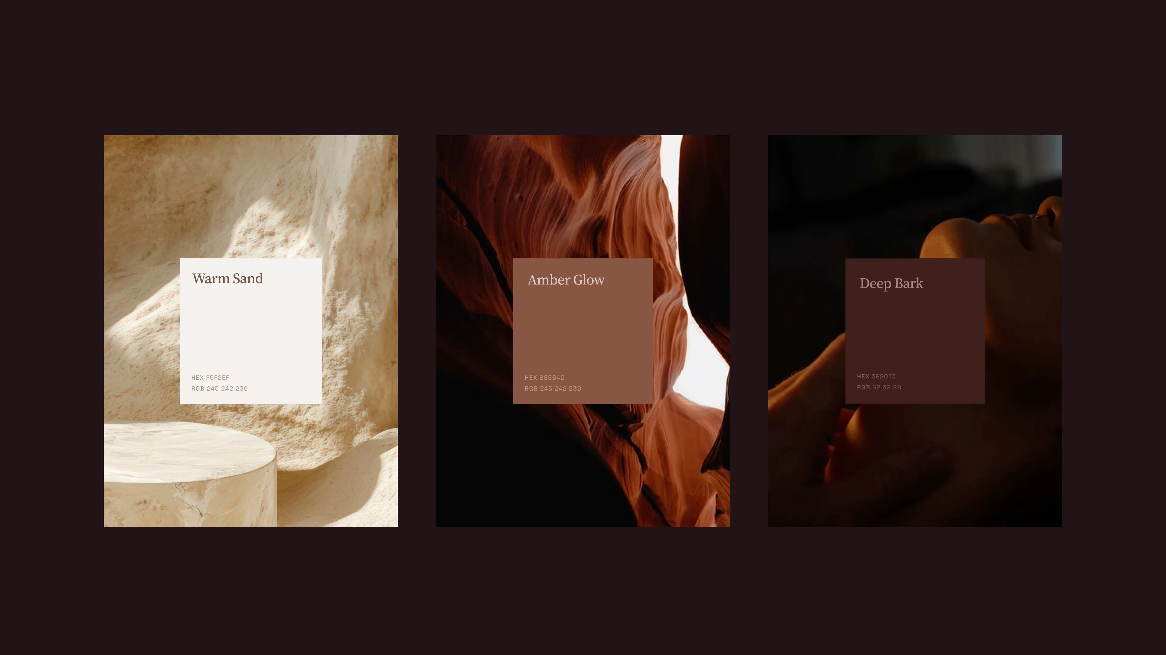
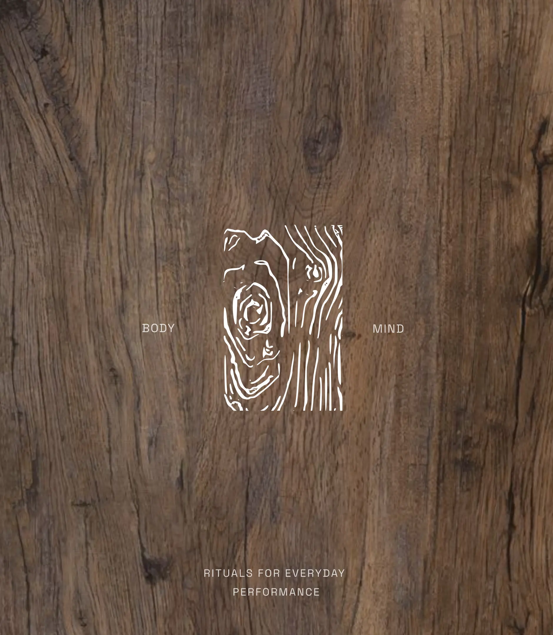
The brand asks one question: what does the body look like when nothing is holding it back? Ombre is the answer. Luxury not as indulgence, as momentum.The entire identity was built from one starting point: the primary ingredient. The palette comes directly from its origin — warm sand, amber, deep bark. Nothing borrowed from the category. The textures go closer: macro shots where human skin and tree bark become hard to tell apart. Both organic. Both built to endure. To let the visuals breathe, the website and graphics are minimal and editorial.
TIMELINE
2 weeks
Collaborators
Karthikeyan S
Nivedha Nirmal
What we did
Brand Strategy
Visual Identity
Website design
Framer development
View