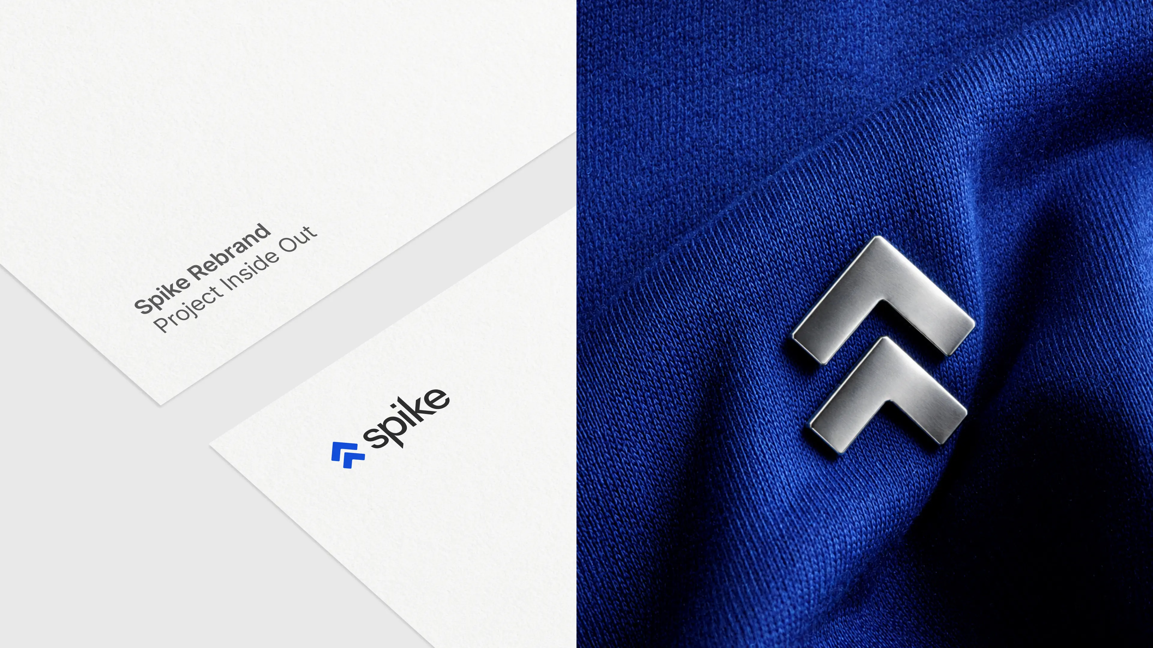
Spike Rebrand
OVERVIEW
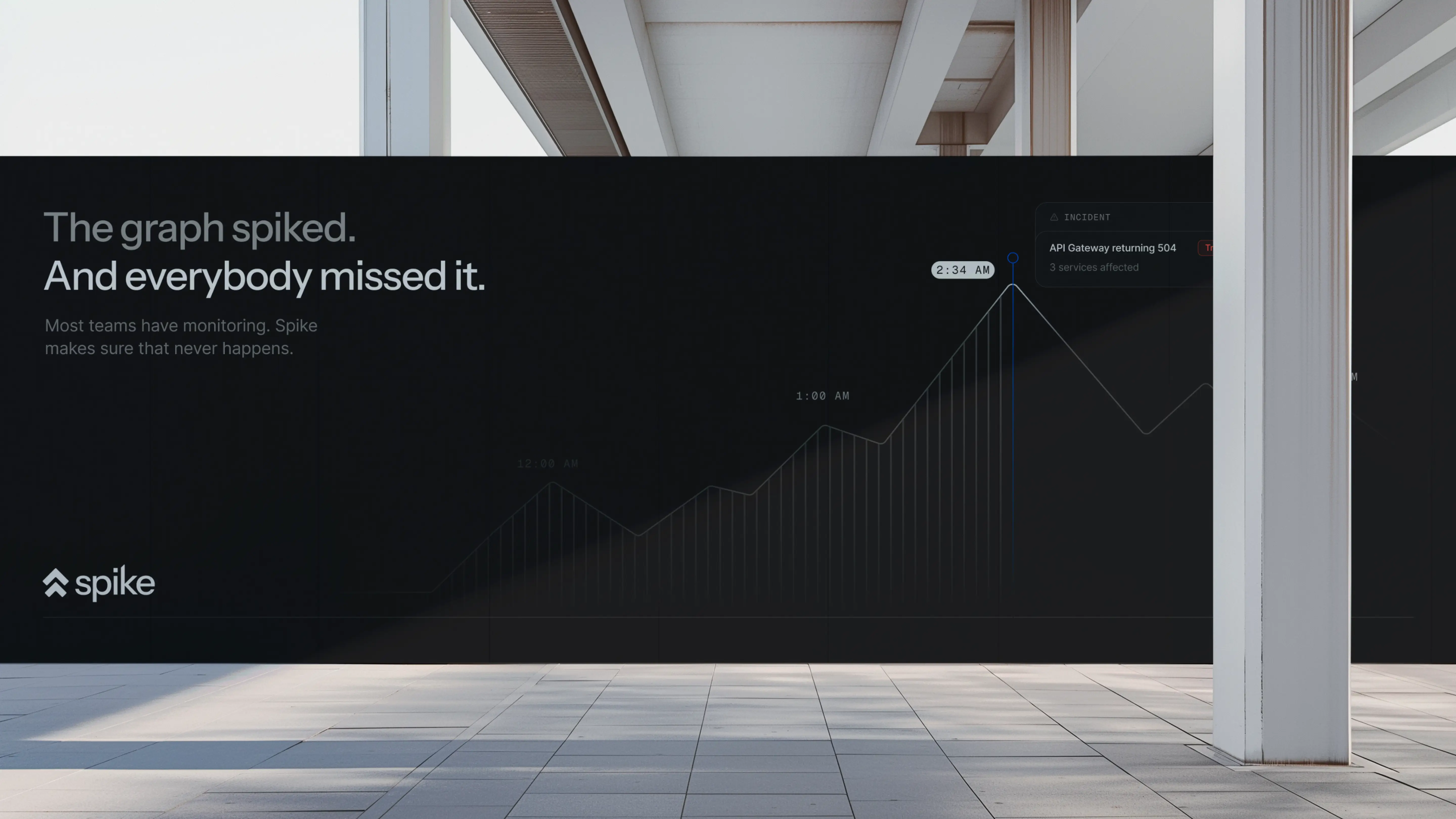
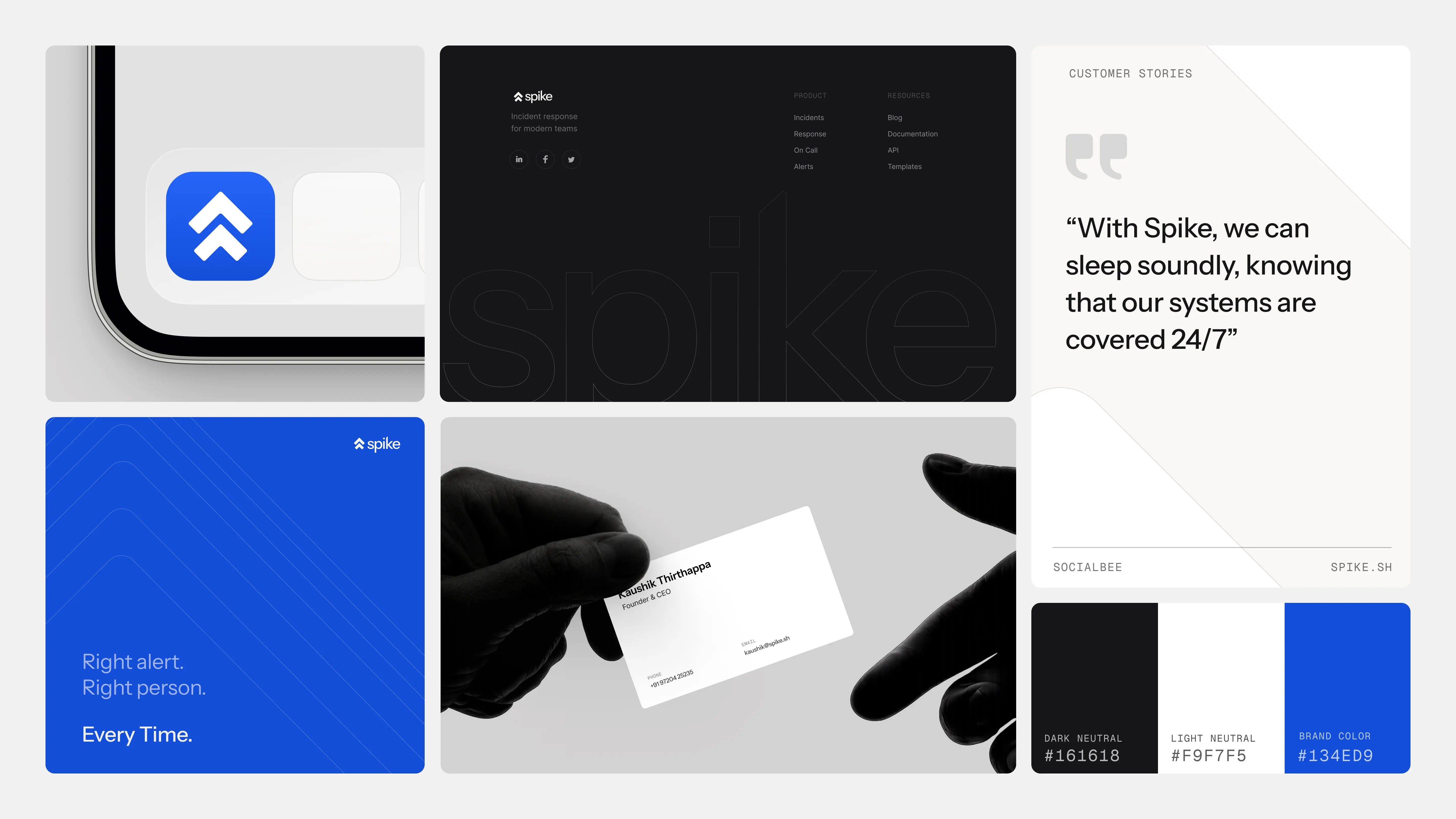
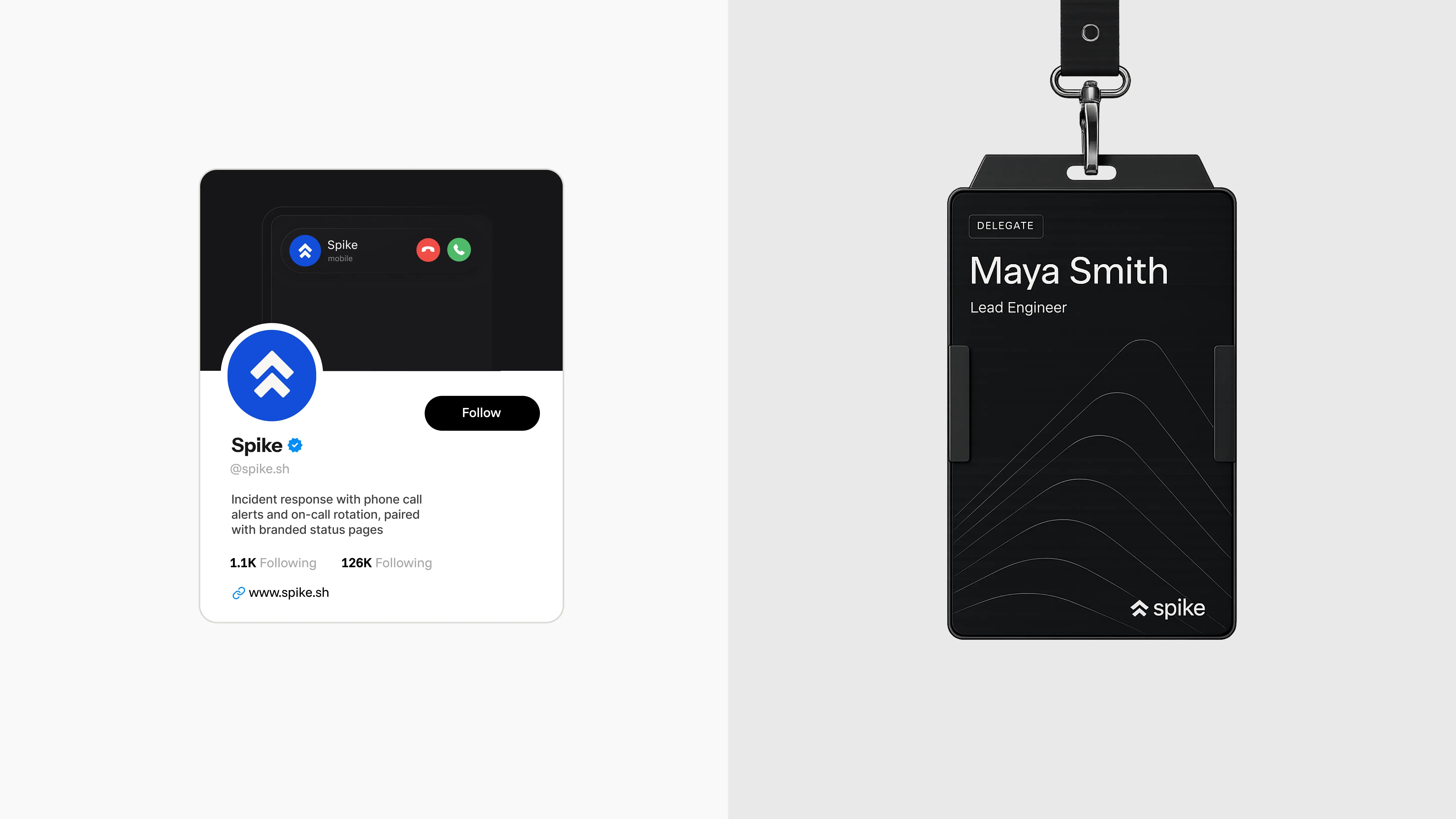
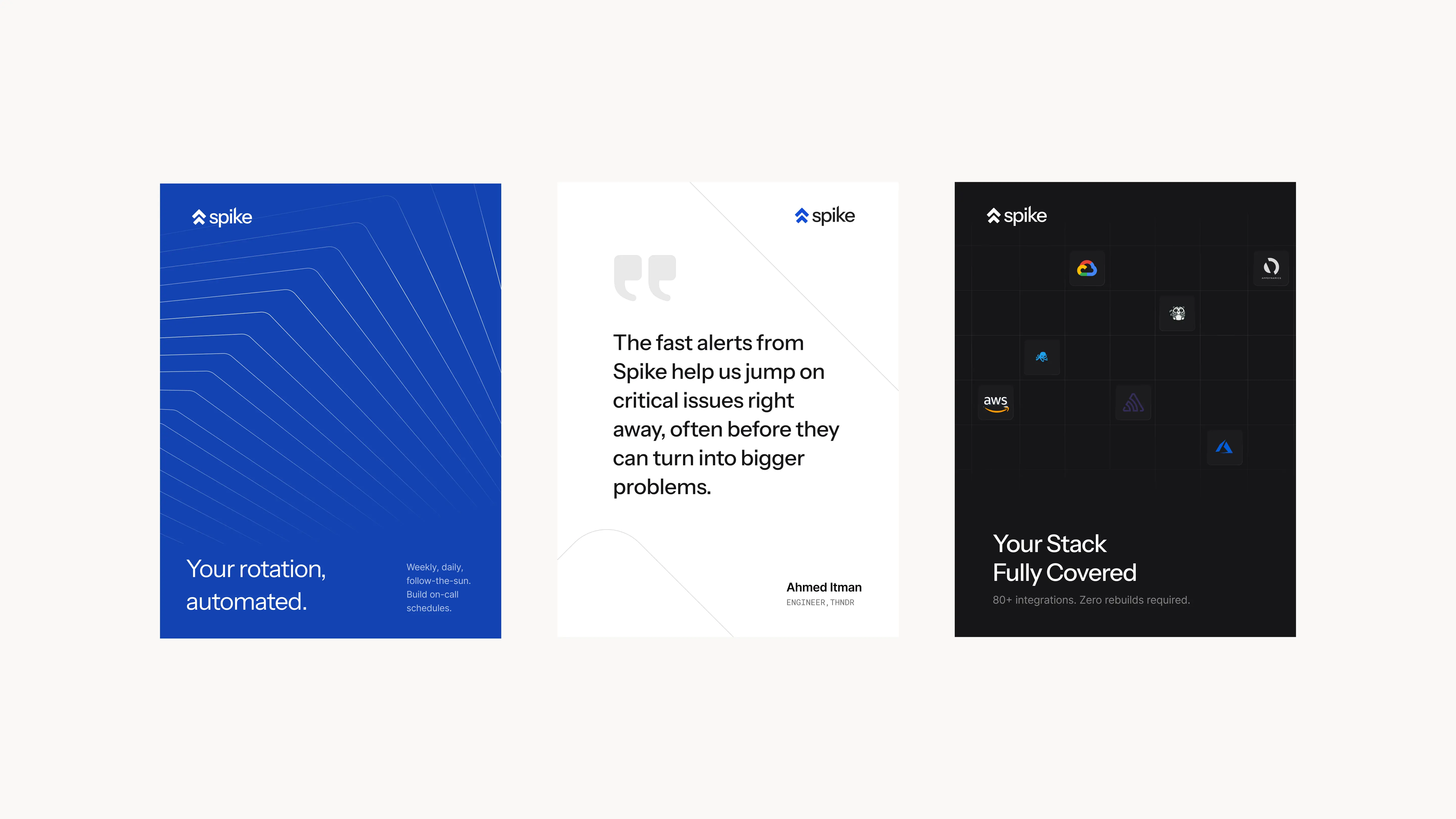
The identity leans fully into the name - literally, the spike that shows up on a graph. That single shape became the throughline, extended into the brand's growth elements and the central story that ties everything together. The "calm in a crisis" personality isn't really about calm at all - it's engineered. The brand looks credible, clean, and polished. It speaks clearly, stays direct, and never leaves things open-ended. That precision is what makes the brand and the product feel like it knows exactly what it's doing.
TIMELINE
March 26 4.5 months
Collaborators
Nivedha Nirmal
Aekansh Kathal
Aradhye Saini
What we did
Brand Strategy
Visual Identity
Product MVP
View